Project Overview
CookEase is an app and website that is designed to help users find recipes regardless of what platform you are on. The product is designed for users of any age and of any technology literacy level.
Project Duration
The project was developed through the month of December 2022.
The problem
Searching for something to cook can be tedious and difficult, especially for people who are not very technologically literate.
The goal
Create a simple app that allows users to find, save, and view recipes.
My role
UX Designer, Researcher, and UI Designer.
Responsibilities
User research, wireframing, and prototyping.
Understanding the user
User research, personas, problem statements, and ideation.
User Research Summary
Interviews were conducted with friends and family. Users wanted a convenient way to quickly find recipes wherever they are so that they can view them later.
Users also wanted to view recipes in a clean interface without distraction.
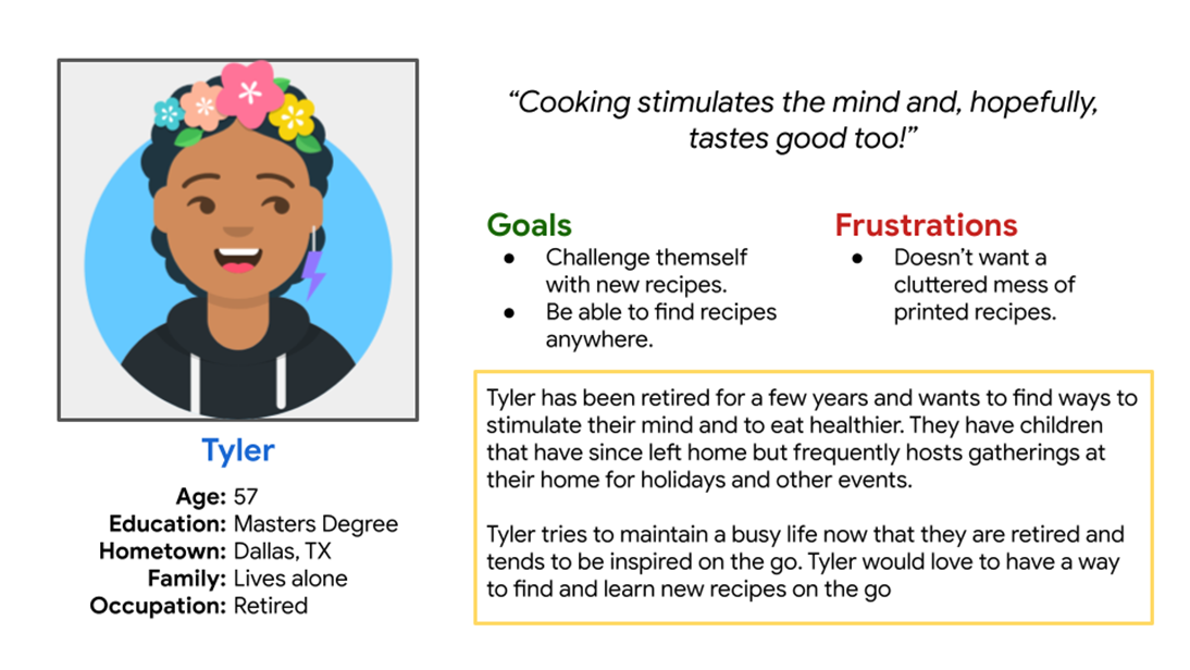
Persona 1: Tyler
Tyler is a retired person with an active social life who needs a way to find recipes on the go because they want to save recipes whenever they are inspired to make later.
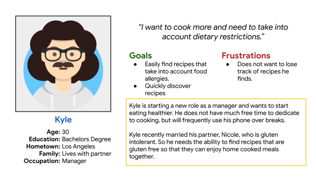
Persona 2: Kyle
Kyle is a busy office worker who needs a way to easily find specific recipes to accommodate dietary restrictions because he wants to make food for people he loves that have dietary restrictions.
Ideation
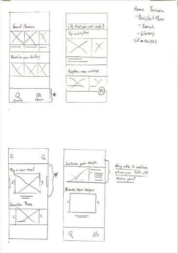
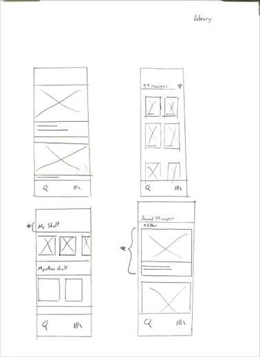
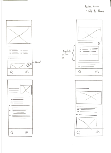
Sketches were made of the screens of the app first. Since this product would be used on the go, I created the mobile app before making the tablet and desktop versions of the product. Functionality would be divided into four major areas. The home screen, recipe search screen, personal library screen, and recipe viewing screen.
Starting the design
Digital wireframes, low-fidelity prototype, and usability studies.

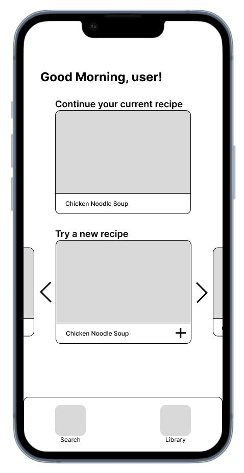
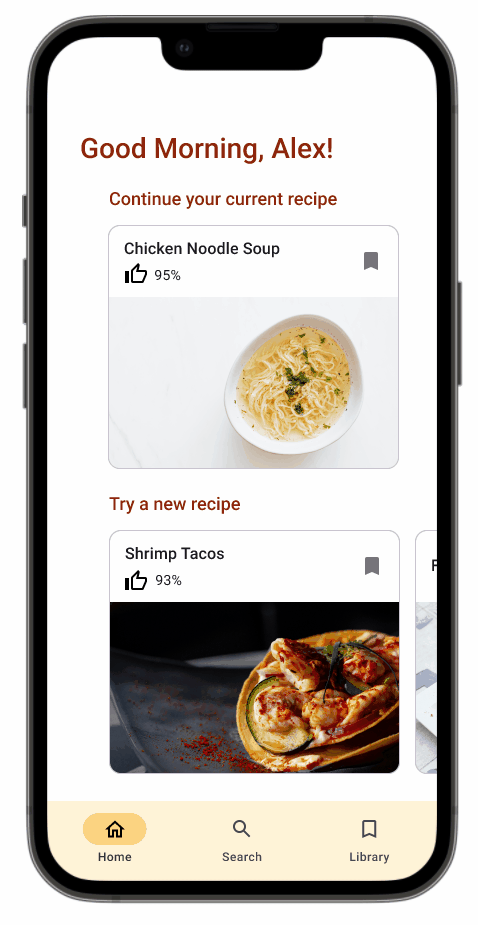
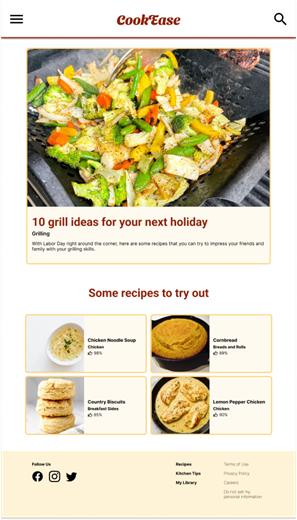
Home screen
To keep the interface clean, I utilized cards in order to organize recipes like how shows are displayed and organized on streaming platforms.
Cards present recipes in an easily understandable and organized way.
Persistent menu allows users to visit different areas of the app at any time.
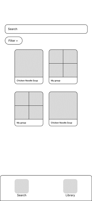
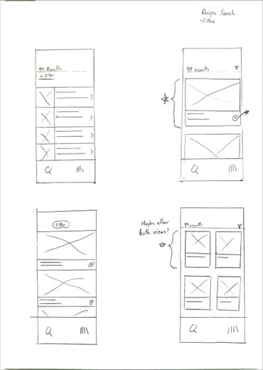
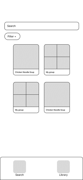
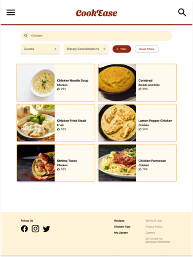
Recipe Search
Recipe search would allow the user to filter recipes based on a variety of parameters. And the cards originally were designed to be squares to allow for more content to be presented on the screen.
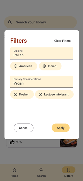
Filters lets users specify content.
Items were squares to allow for more content to appear on screen.
Low-fidelity Prototype
The low fidelity prototype connects the screens to establish the primary flow of the product, as well as the screens that appear when applying filters.
The low fidelity prototype can be accessed here.
Usability study findings
It was not possible for users to return home after leaving the home screen.
Users confused the library and search screens.
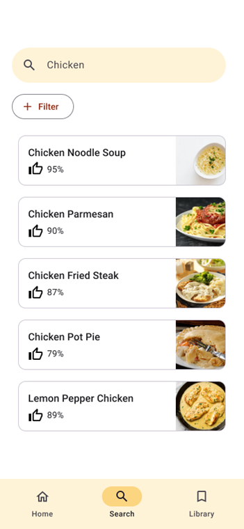
Users wanted the cards on the search and library screens to be larger to make reading them easier.
Refining the design
Mockups, high-fidelity prototypes, and accessibility
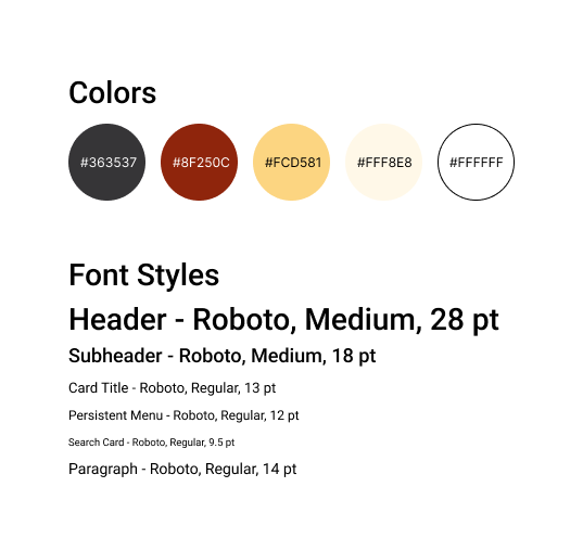
Style Guide
Mockups
Before usability study

After usability study
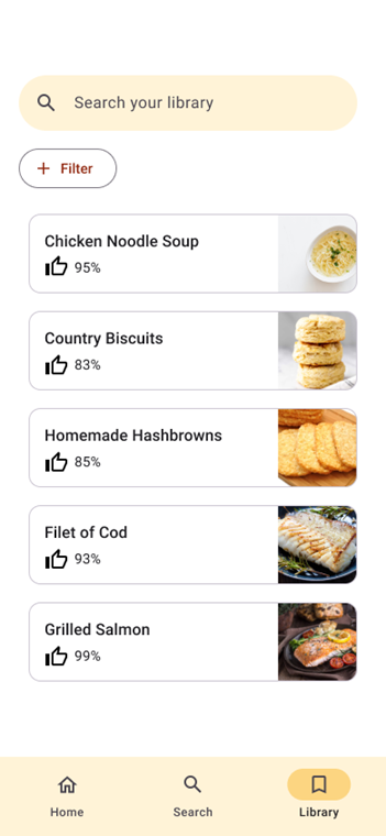
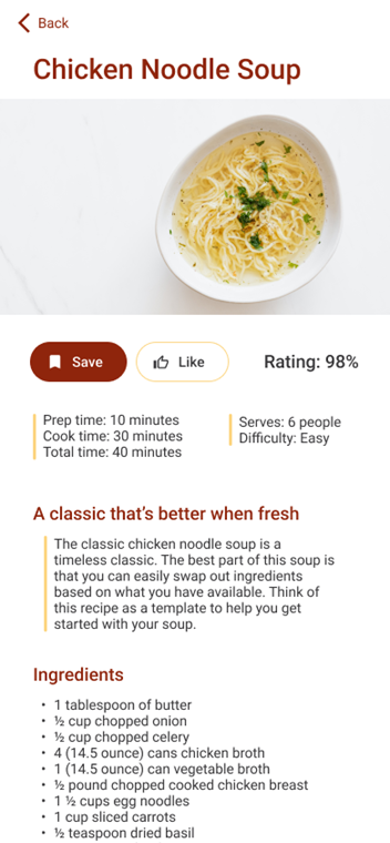
Instead of having two columns, I decided to do a single column of thinner cards that would allow for a large amount of content while having legible text.
Additionally, ratings were added to the cards.
Key Mockups

High-Fidelity Prototype
High-fidelity prototype for the mobile version of the CookEase design can be accessed via the link.
Accessibility Considerations
Font size was considered across every screen to ensure legibility for those who are visually impaired.
A color scheme with high contrast was chosen in order to make text more legible.
Responsive Design
Information architecture and responsive design
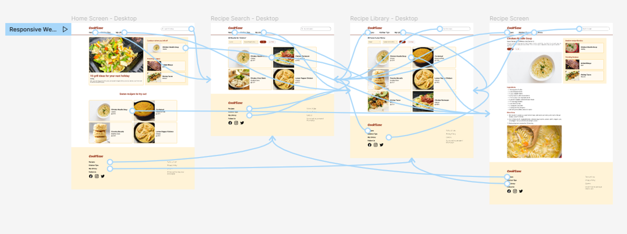
Sitemap
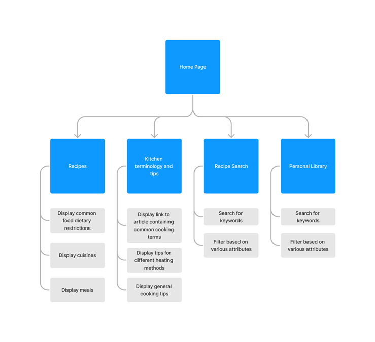
This sitemap organized some of the functions of the app into a website format.
Responsive Designs - Home Screen
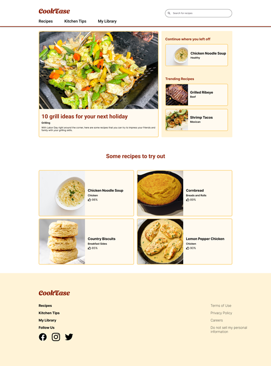
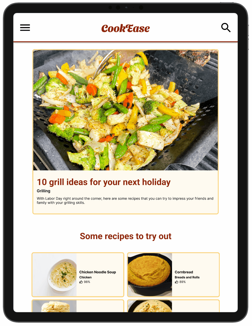
The primary focus of the home screen was the article and recipes. With the larger screen, I added more recipes that the user could view.
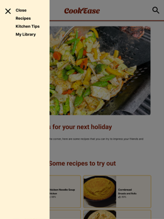
For smaller screens, the menu was consolidated into a hamburger menu.
Responsive Designs - Recipe search and library
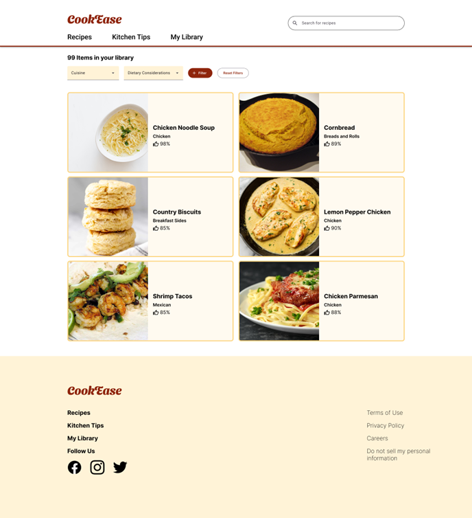
The search and library screens could be largely the same between screen sizes.
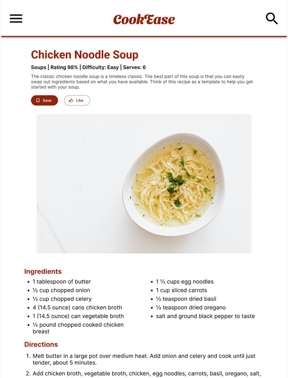
Responsive Designs - Recipe Screen
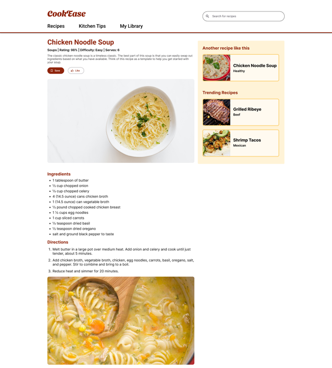
On the recipe screen, I utilized the larger screen to place recipe recommendations to suggest new recipes for the user.
On the smaller screen, I only kept the recipe itself.
Tablet and Desktop Prototypes
Going Forward
Takeaways and next steps
Impact
CookEase was received well by participants in the user research sessions in the final iterations. Users enjoyed the product’s ease of use and the focused UI of reading recipes.
What I Learned
The process of developing a mobile version first and then making tablet and desktop versions via progressive enhancement.
Deciding what features to add that complement the core function of pages when designing for larger screens.
Next Steps
Work on the Kitchen Tips section of the desktop and tablet versions of the website.
Conduct additional usability studies on new screens to ensure a good user experience.