Project Overview
This site is a redesign of the pet viewing flow for the Irvine Animal Care Center. The website is targeted for users of all ages who want a simple website to view and request interviews for adopting pets.
Project Duration
November 2022 through December 2022
The Problem
The current website for Animal Care Center has inconsistent styling through the flow of using pets and has a poor mobile site implementation.
The Goal
Make styling more consistent across the primary flow of the website and make the mobile experience of using the site less cumbersome.
My role
UX and UI designer, researcher.
Responsibilities
User research, wireframing, and prototyping.
Understand the user
User research, personas, problem statements, and user journey maps
User Research Summary
Interviews were conducted with friends and family who were interested in adopting pets. Before interviews started, it was thought that users would primarily have problems utilizing older websites to find pets.
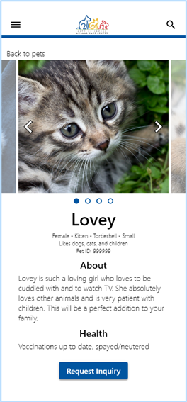
Interviews revealed that users had problems viewing an animal shelter’s adoption website on their phones. They also wanted the ability to know an animal’s personality and whether they were good with other animals or children before scheduling appointments to meet the pets.
Pain Points
Shelter websites are often utilizing older technology that doesn’t respond to screen size, resulting in a poor mobile experience for users.
Users want to have a general idea of what the pet’s personality is like before adopting in addition to basic pet info.
Users want to know and filter pets that have a good relationship with other pets or children.
Persona: Aaron
Aaron is a software developer who needs to find pets via multiple platforms because he wants to spend time to ensure he will find the perfect pet to provide company at home.
Persona: Sarah
Sarah is a manager who needs a way to easily find and filter animal shelter listings because she wants to find pets that will work for her household.
User Journey Map
Sarah is a manager who needs a way to easily find and filter animal shelter listings because she wants to find pets that will work for her household.
Starting the design
Site map, paper wireframes, digital wireframes, low-fidelity prototype, usability studies
Site Map
The site map for this website follows a user finding and requesting an interview with the staff at the animal shelter to adopt the chosen pet.
Paper Wireframes
Homepage
Paper iteration solidified shared elements that would be used throughout the website and the overall layout of pages.
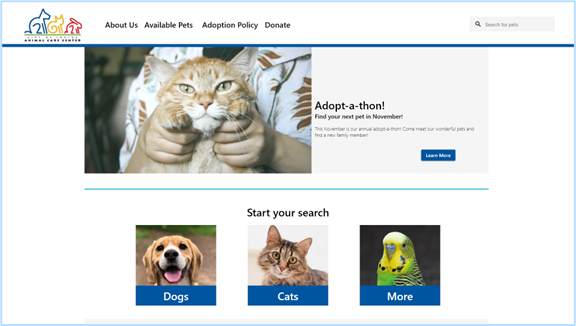
For the home page, it was decided to use a hero image and quick links to have users search for pets.
Pet Listings
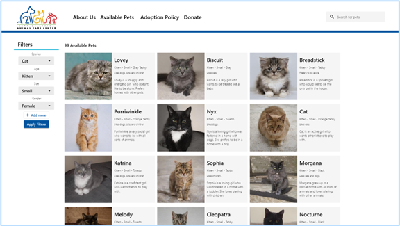
Pet listings were decided to be an array of listings. The left side of the page reserved for filters that the user could use to specify specific pets.
Pet Review
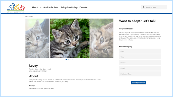
The pet review page was decided to utilize two columns. One to list pet images and details and the other to request an inquiry with the animal shelter to start the adoption process.
Digital Wireframes
Homepage
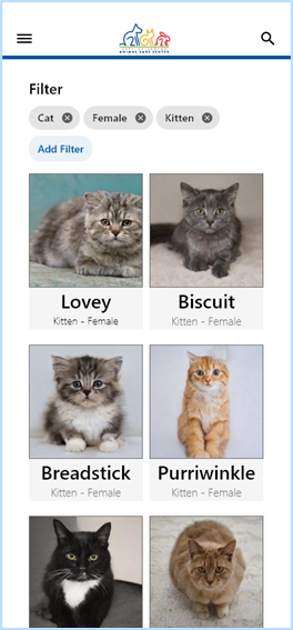
The pet listing page featured an array of listing cards that would be able to list many pets and would be easy to replicate on a mobile device with some modification.
Pet Listings
The pet listing page featured an array of listing cards that would be able to list many pets and would be easy to replicate on a mobile device with some modification.
Low-fidelity Prototype
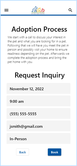
This low-fidelity prototype shows the flow of finding pets and requesting an inquiry. There are two versions.
There is a desktop prototype and a mobile prototype to demonstrate different screen sizes.
Usability Study Findings
Round 1 Findings
Users thought the navigation was straightforward.
Round 2 Findings
Users Wanted a way to see more pictures of the pets.
Footer was needed to share other resources that are shared among all Irvine city websites.
Picture carousels were adjusted to be more readable.
Refining the design
Mockups, high-fidelity prototypes, and accessibility considerations
Style Guide
Mockups
Homepage
Mockups utilized a modified version of the city of Irvine’s typography and color palette. Incorporated feedback to include city resources in the footer.
Pet Review
Before usability study
After usability study
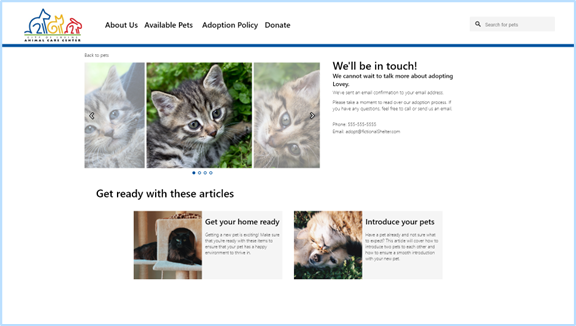
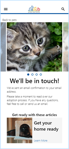
Screens for pet info and confirmation that displayed pet images were adjusted to have scrolling image slide shows.
Key Mockups - Desktop
Key Mockups - Mobile


High-fidelity prototype
Accessibility Considerations
Contrast and Coloring
Elements of the pages and their contrast were considered to maintain readability.
Type
Modifications were made to the City of Irvine typography to help make sections of the page clearer.
Going Forward
Takeaways and next steps
Impact
Users enjoyed the ease of use of being able to find a pet, regardless of what platform they were on.
What I Learned
As my first responsive design, I learned the importance of considering other screen sizes when designing websites and keeping the user’s needs front of mind.
I learned how to use Adobe XD for creating wireframes, mockups, and prototypes for different platforms.

