Project Overview
ArcadeGuide is an app designed to help users find arcades and preview arcade games. The app targets users who enjoy going to arcades but have busy schedules.
Project Duration
August 2022 through November 2022
The problem
Finding arcades with games that you like can be difficult and challenging without visiting the location.
The goal
Allow a user to confidently find arcades or other locations they love with games that they will engage with.
My role
UX & UI Designer and UX Researcher.
Responsibilities
User research, wireframing, and prototyping.
Understanding the user
User research, personas, problem statements, and user journey maps
User Research Summary
Interviews were conducted with friends and some colleagues of mine. One of the problems users would encounter when visiting an arcade was being able to figure out if they would enjoy a game that they found.
The interviews revealed that there were more problems involved with finding a game than just finding something players liked. Players wanted games that were accessible to them and wanted to simplify the process of finding new arcades to visit.
Pain Points
Some arcades have many different games to choose from. Finding a game a player will enjoy is often trial and error and not easy to figure out.
Players may have a variety of things they would prefer to avoid when it comes to locations or games.
Players may have games that they love already and would like to know if the games they like are at arcades near them.
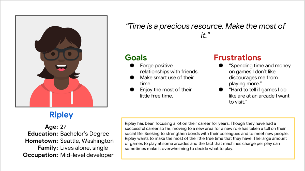
Persona: Ripley
Ripley is a busy software developer who needs help finding games they will like so they can focus on building friendships.
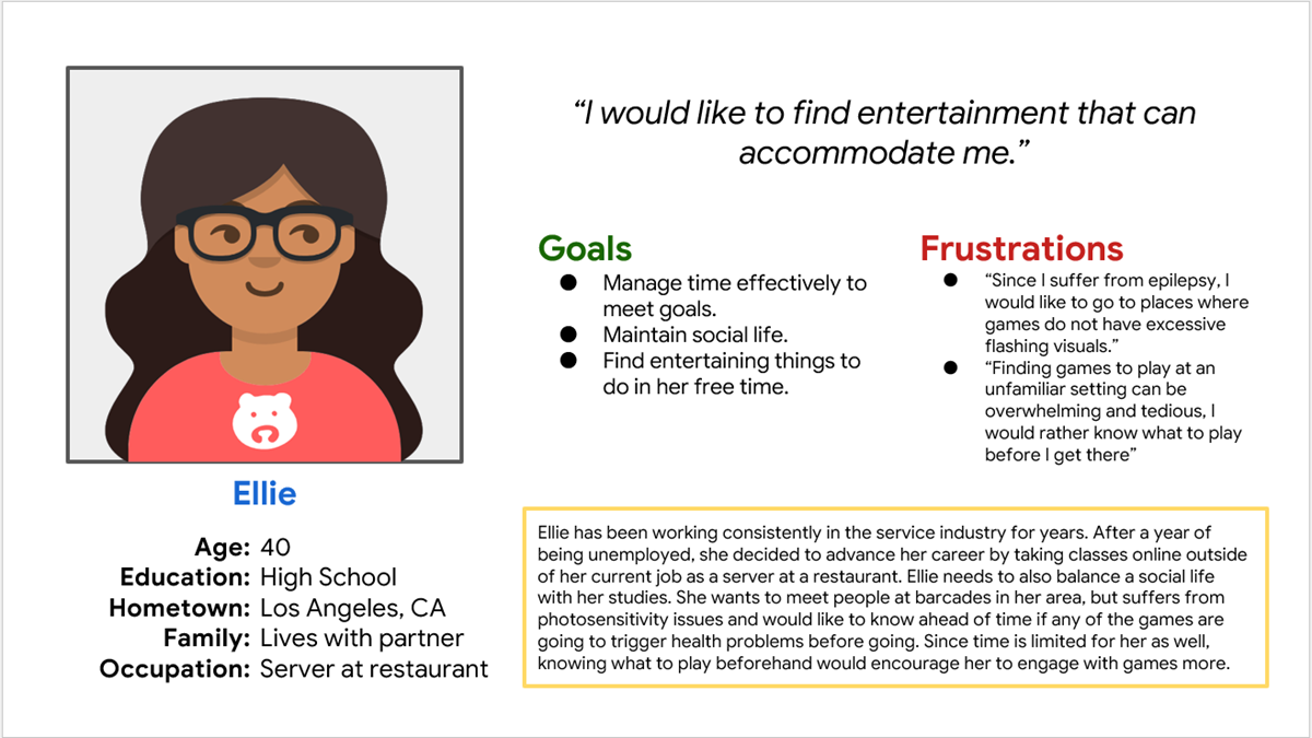
Persona: Ellie
Ellie is a service industry worker who needs help finding arcades without photosensitivity triggers so that they can visit arcades with peace of mind.
User Journey Map
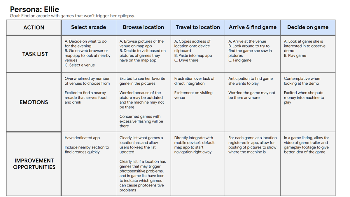
Mapping Ellie’s user journey revealed how helpful it would be to allow users to filter locations and games that may cause issues for photosensitive users.
Starting the design
Paper wireframes, digital wireframes, low-fidelity prototype, and usability studies

Stars indicated what elements were to stay in the initial digital design
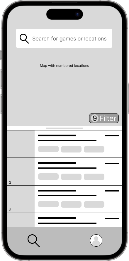
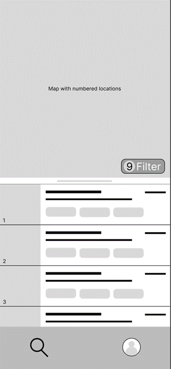
Paper Wireframes
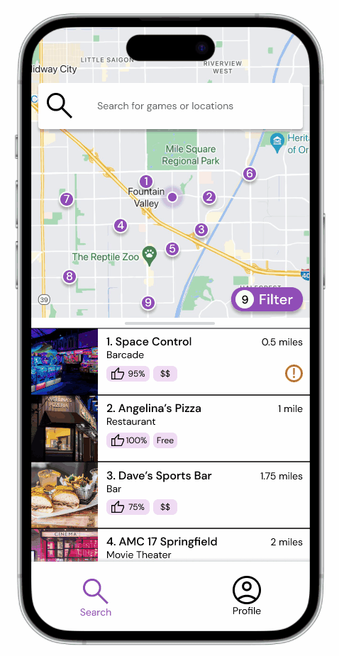
Iterating over various layouts for the home screen helped me decide on what aspect of locations should I focus on. Feedback from users found that people preferred to know more about locations themselves rather than how far they were.
Digital Wireframes
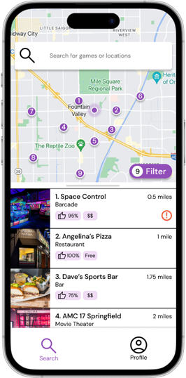
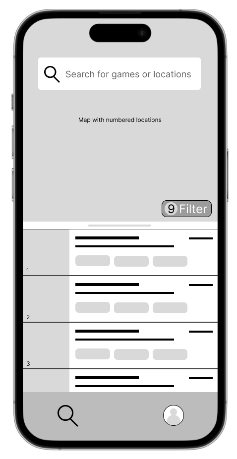
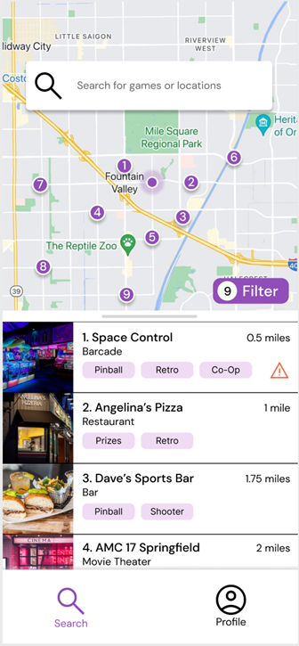
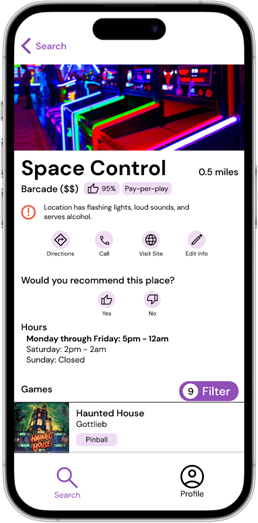
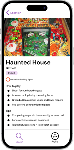
Based on these findings, I made sure to try and make the locations themselves the primary focus of what the user interacts with by using cards to represent locations in this screen, and games in later screens.
Having a map with corresponding numbered locations gives a sense of how far arcades are.
Using cards for locations and games provides quick glances of info about each item.
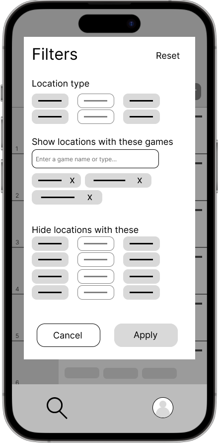
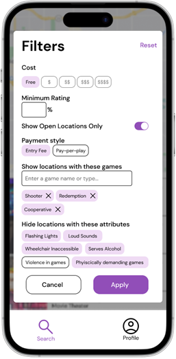
Users wanted the ability to narrow down choices of both locations and games to tailor to their wants and needs. These filters can be applied on both the home screen and on a location screen to filter locations and games respectively.
Filters can be used to specify the kinds of locations and games they want featured in the card stack
Low-fidelity prototype
This low fidelity prototype connected the primary flow of finding locations and also the screens of the persistent menu at the bottom.
You can view an interactive prototype by clicking the image or here.
Usability Study: Findings
Studies were conducted to find usability issues in low-fidelity and high-fidelity prototypes.
Round 1 Findings
Users wanted to search for games or locations directly.
Users enjoyed the concept of filters.
Users wanted filters to carry over to locations from the map screen.
Round 2 Findings
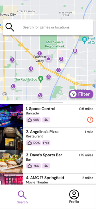
Users wanted reviews to find desirable locations.
Users wanted to know a location’s admission style.
Users wanted to know a location’s price tier.
Users wanted to know a location’s admission style.
Users wanted to know a location’s price tier.
Refining the design
Mockups, high-fidelity prototype, and accessibility considerations
Typography

Color Palette
Location and Game Cards
Mockups
Early designs primarily focused on the app providing locations to the users, but didn’t account for users wanting to search for items directly. I added a search bar on the home screen to the top to remedy this.
Before usability study

After usability study
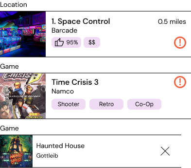
A second usability study found that users would rather have rating and pricing info on the main screen rather than individual tags of the games at the location. I swapped out the tags with rating and pricing information.
Before usability study
After usability study
Key Mockups
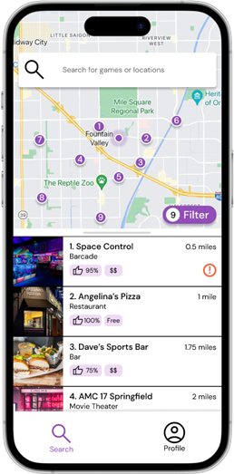
High-fidelity prototype
The final high-fidelity prototype presented a defined style, cleaner user flows, and met the needs users had when trying to find arcades to play at.
You can view the high-fidelity prototype by clicking the image.
Accessibility Considerations
Contrast levels were considered on every screen in order to make the text legible for people of varying visual ability.
Animations throughout the app were long enough to allow users to have a sense of where they are in the app and to not overwhelm users with sudden changes.
Going forward
Takeaways and next steps
Impact
The app concept overall was well received by a number of participants, some of which who expressed desire for this to become a real funcional product. Users loved the idea of being able to find new places to spend time with friends or to play various machines that they loved.
What I learned
It is critical to keep the user at the forefront of your designs. On a technical level, I learned the overall UX design process from defining user problems, wireframing, designing prototypes, and using user research to iterate on my designs.
Next steps
Add screens to address user feedback, like creating new locations and moderation screens for location owners to moderate content.
Conduct additional user research based on iterations made to the app.